Background
品牌介紹
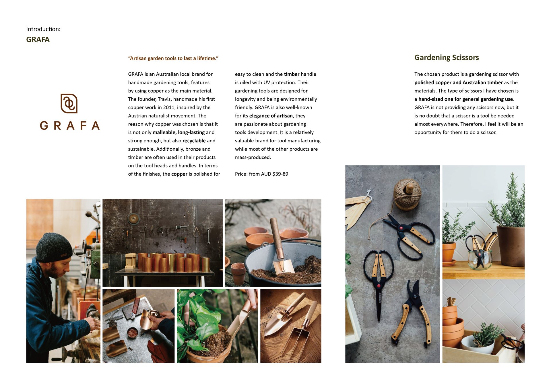
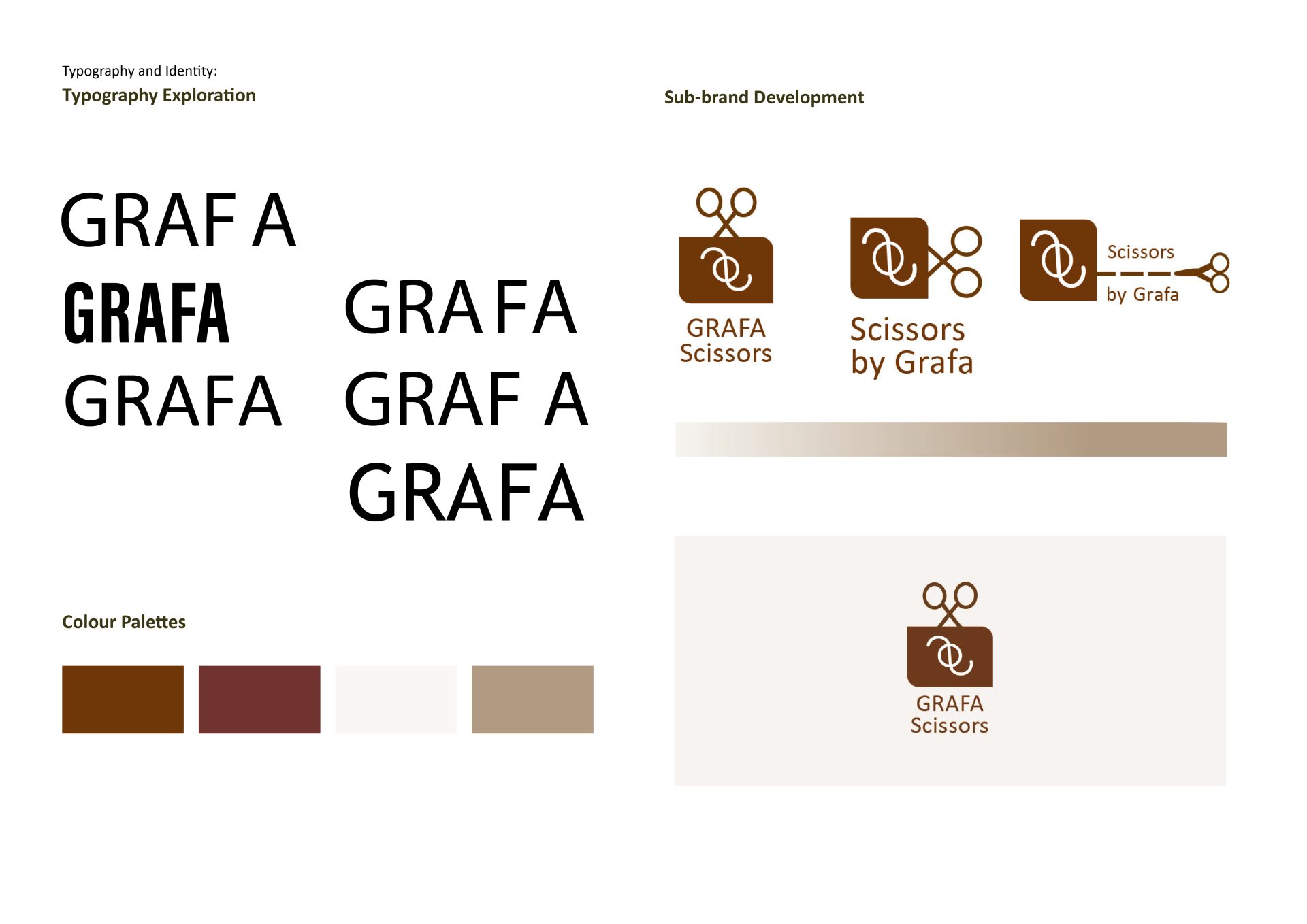
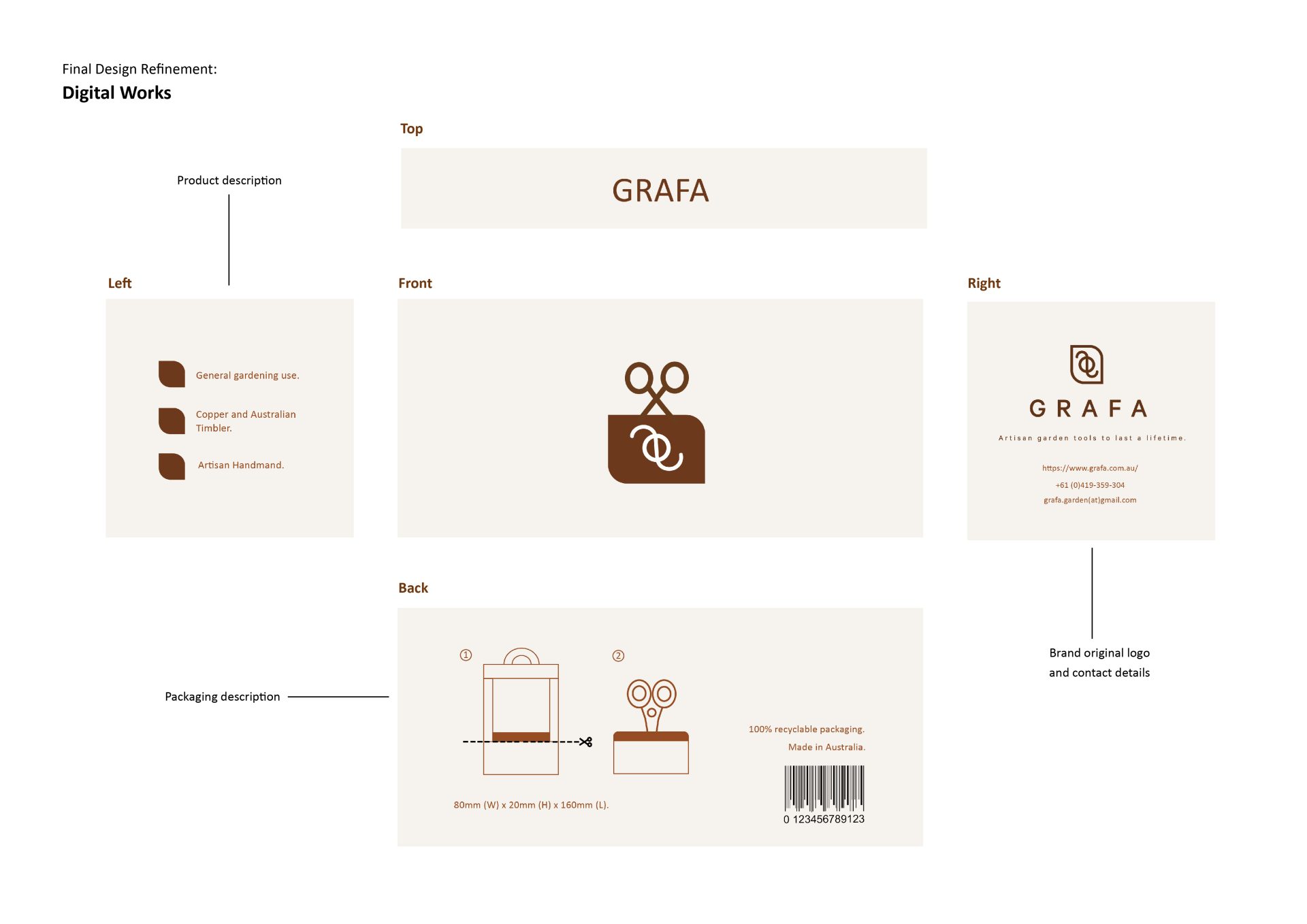
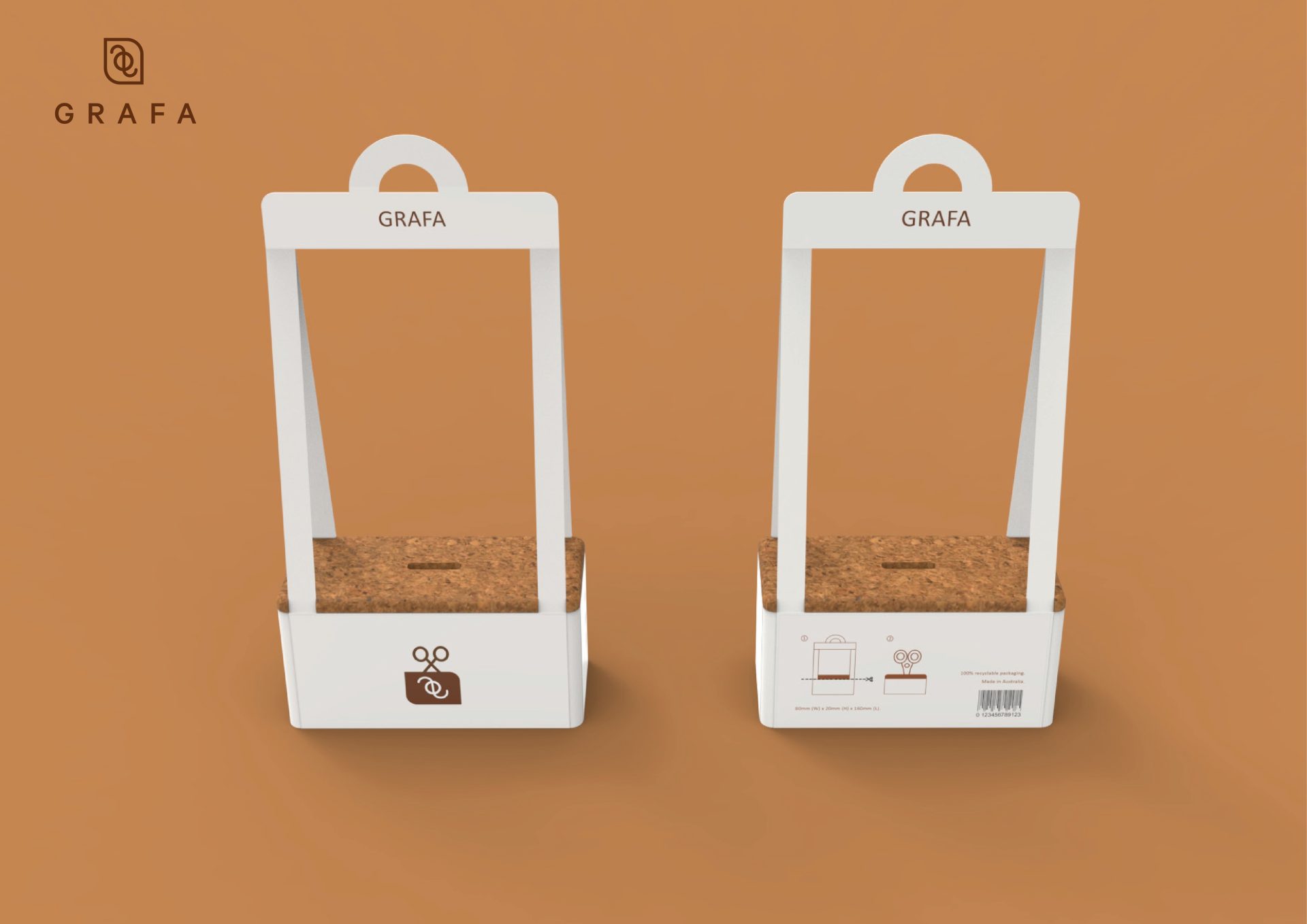
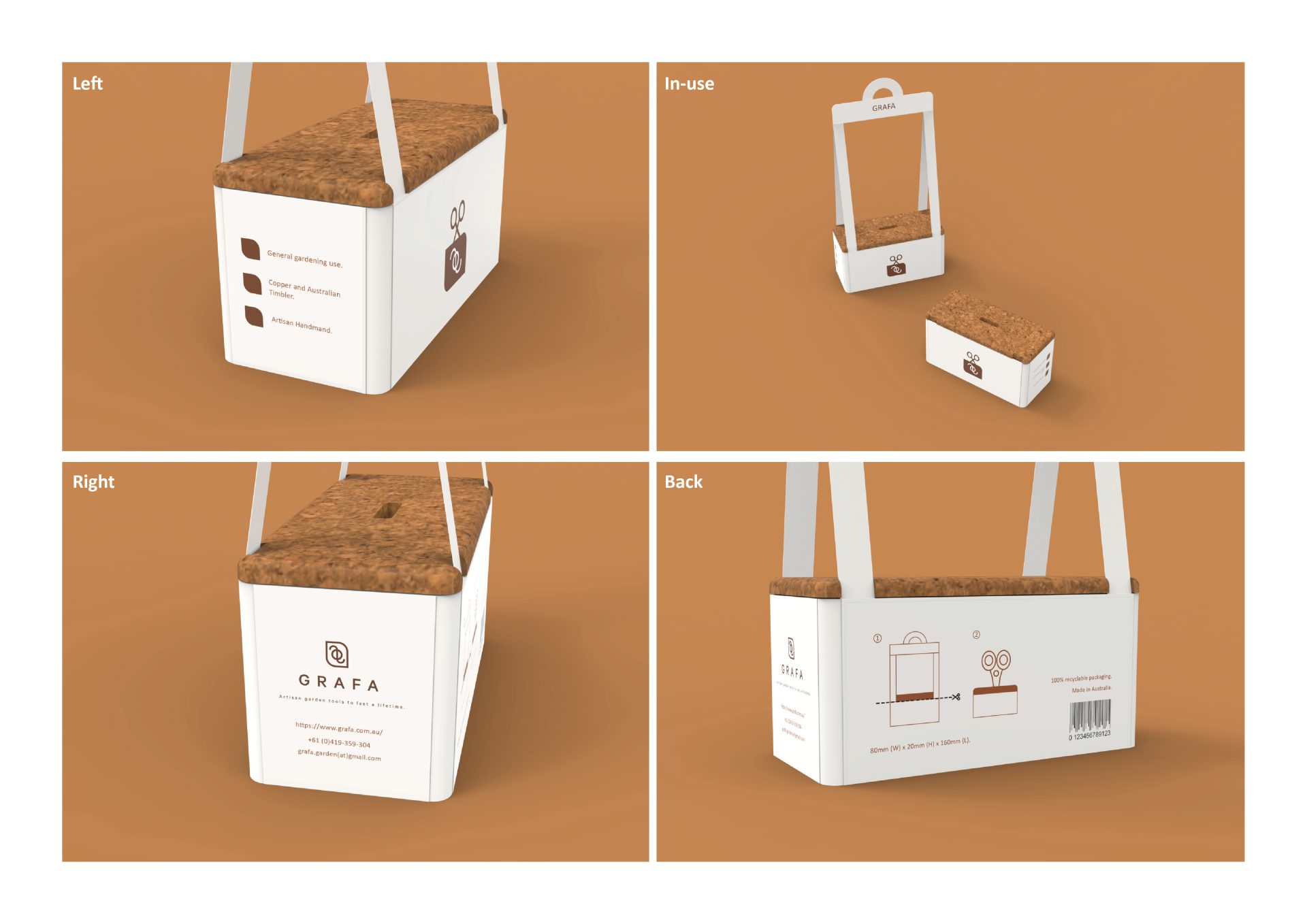
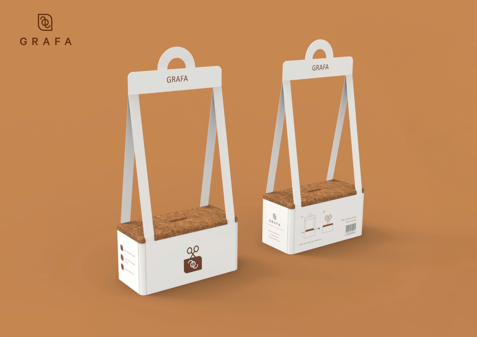
GRAFA “Artisan garden tools to last a lifetime.”
品牌創辦人 Travis 在 2011 年製作了第一件銅製作品,靈感來自 奧地利自然主義運動。選用銅的原因在於它不僅 具延展性、耐用與堅固,還能 回收再利用、符合永續性。此外,他們的產品也常在 工具頭與手柄 上使用 青銅與木材。
The founder, Travis, handmade his first copper work in 2011, inspired by the Austrian naturalist movement. The reason why copper was chosen is that it is not only malleable, long-lasting, and strong enough, but also recyclable and sustainable. Additionally, bronze and timber are often used in their products on the tool heads and handles.
Project Brief
The project was to design a brochure that also serves as the exhibition’s key visual, offering the first impression to the audience. Beyond providing exhibition information, the brochure also extends as the foundation of the exhibition’s identity system, applied to posters, tickets, social media, and promotional materials.
The project was to design a brochure that also serves as the exhibition's key visual, offering the first impression to the audience. providing exhibition information, the brochure also extends as the foundation of the exhibition's identity system, applied to posters, tickets, social media, and promotional materials. Beyond providing exhibition information, the brochure also extends as the foundation of the exhibition's identity system, applied to posters, tickets, social media, and promotional materials.
Designed by Miao-Chia Chen
Special Thanks to Swinburne University of Technology
DesignConcept
The title of the brochure is “Vision on Television: George Olden.” The cover visual shows a vintage television with an eye on the screen—referencing the CBS logo while symbolizing Olden’s vision for the future of design.
The concept is inspired by the technique of Olden’s “Omnibus”. The cropped television and an eye on it present his experience in the television advertising industry. Therefore, the idea of intersection is repeated in all of the pages in the brochure.
The title of the brochure is "Vision on Television: George Olden." The cover visual shows a vintage television with an eye on the screen-referencing the CBS logo while symbolizing Olden's vision for the future of design. The cover visual shows a vintage television with an eye on the screen-referencing the CBS logo while symbolizing Olden's vision for the future of design.
The concept is inspired by the technique of Olden's "Omnibus". The cropped television and an eye on it present his experience in the television advertising industry. The cropped television and an eye on it present his experience in the television advertising industry. Therefore, the idea of intersection is repeated in all of the pages in the brochure. Therefore, the idea of intersection is repeated in all of the pages in the brochure.