

Background
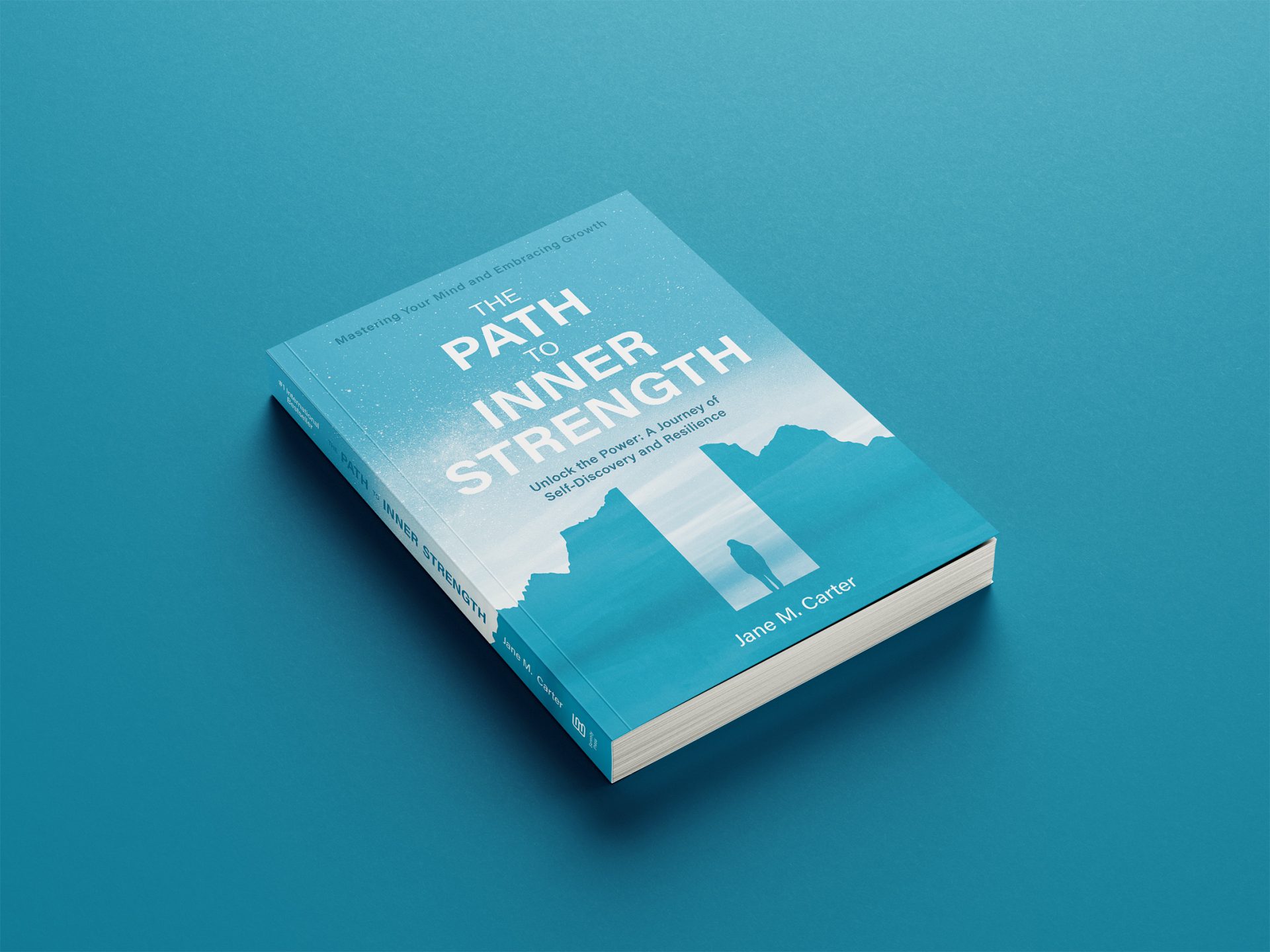
The Path to Inner Strength is a book on self-exploration and emotional growth, recounting how the author gradually developed the courage and resilience to face life’s challenges. The narrative centers on the awakening of inner strength, guiding readers to see reflections of their own journeys within its pages.
Genre: Self-Help / Wellness
Book Cover Design 書籍封面設計 — 艾蘭小島設計

Project Brief
Design a book cover that embodies the themes of “growth” and “inner strength.” The design should communicate emotional depth and inspiration, appealing to readers of psychological and coming-of-age fiction.
Design Rationale
“Inner strength” is not just a display of power, but a resilience shaped through vulnerability and struggle.With interlacing light and dark color blocks and layered mountain silhouettes, the visual creates an image of carving a path upward—symbolizing the author’s inner journey.The overall composition feels grounded yet hopeful, inviting readers into a quiet, unfolding journey of emotional renewal.
