Background
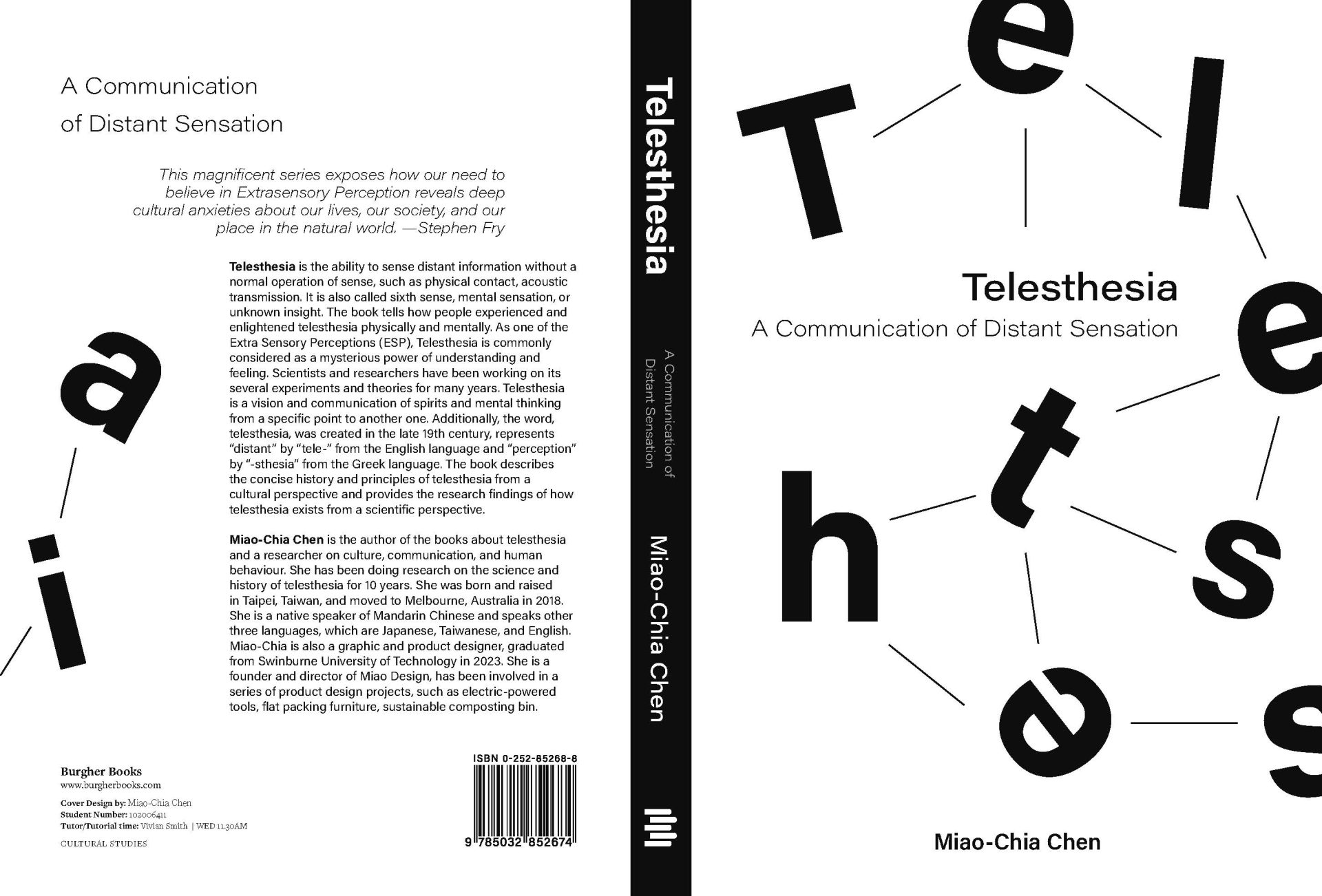
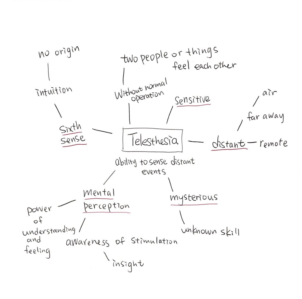
The book Telesthesia is about Extra Sensory Perceptions (ESP), focusing on the concept of “distant sensation.” It explains the concise history of telesthesia and analyzes its main principles from cultural and scientific perspectives. The design intention was to visualize the idea of a “mind net” where one who can use telesthesia is able to access information released by people or objects.
Genre: Science、Academics、Textbooks
Project Brief
Designing a cover for Telesthesia that reflects the book’s central theme, with a clean and professional presentation that highlights the title while maintaining visual hierarchy and readability.
Book Cover Design 書籍封面設計 — Miao-Chia Chen
Special Thanks Special Thanks - Swinburne University of Technology

Design Rationale
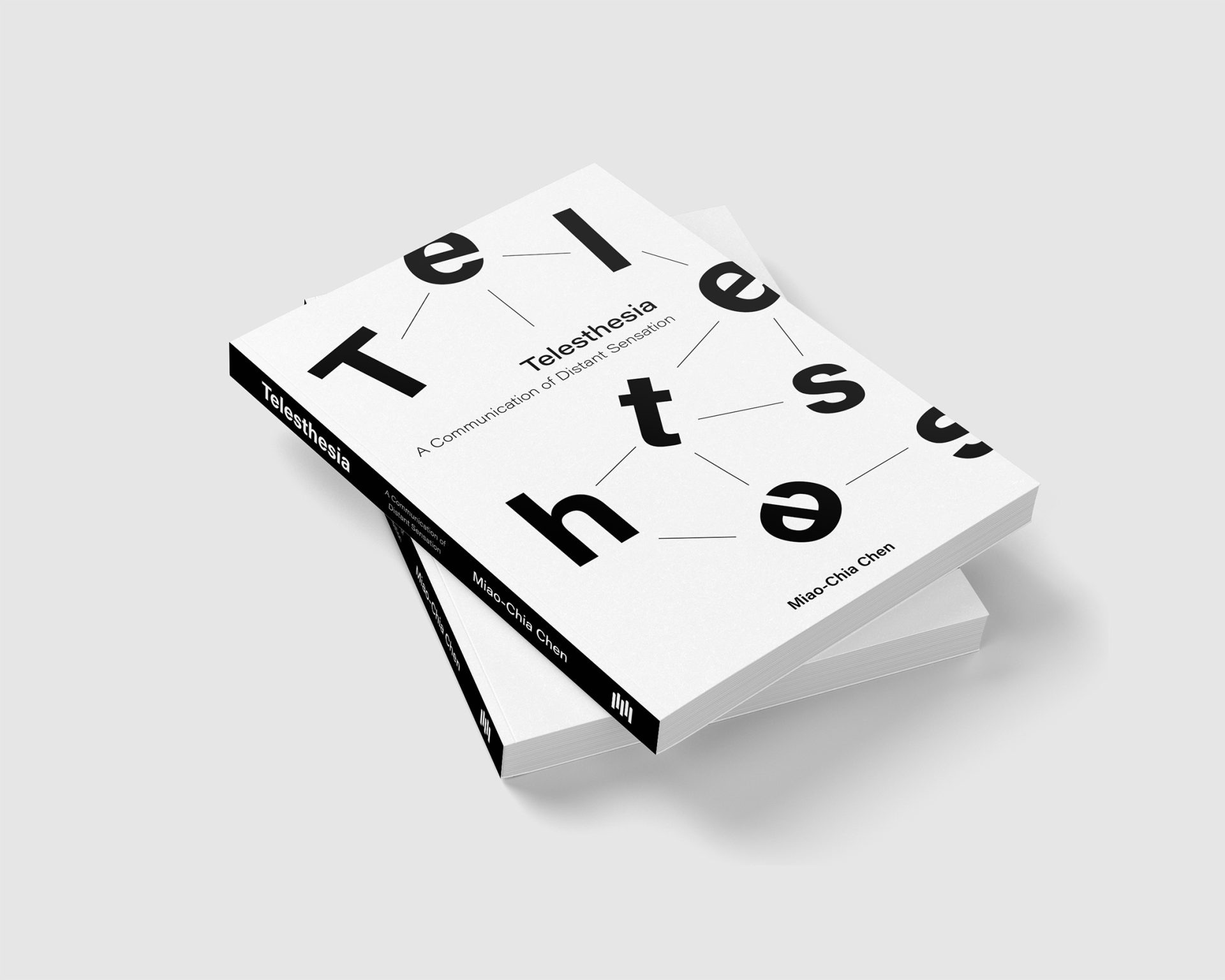
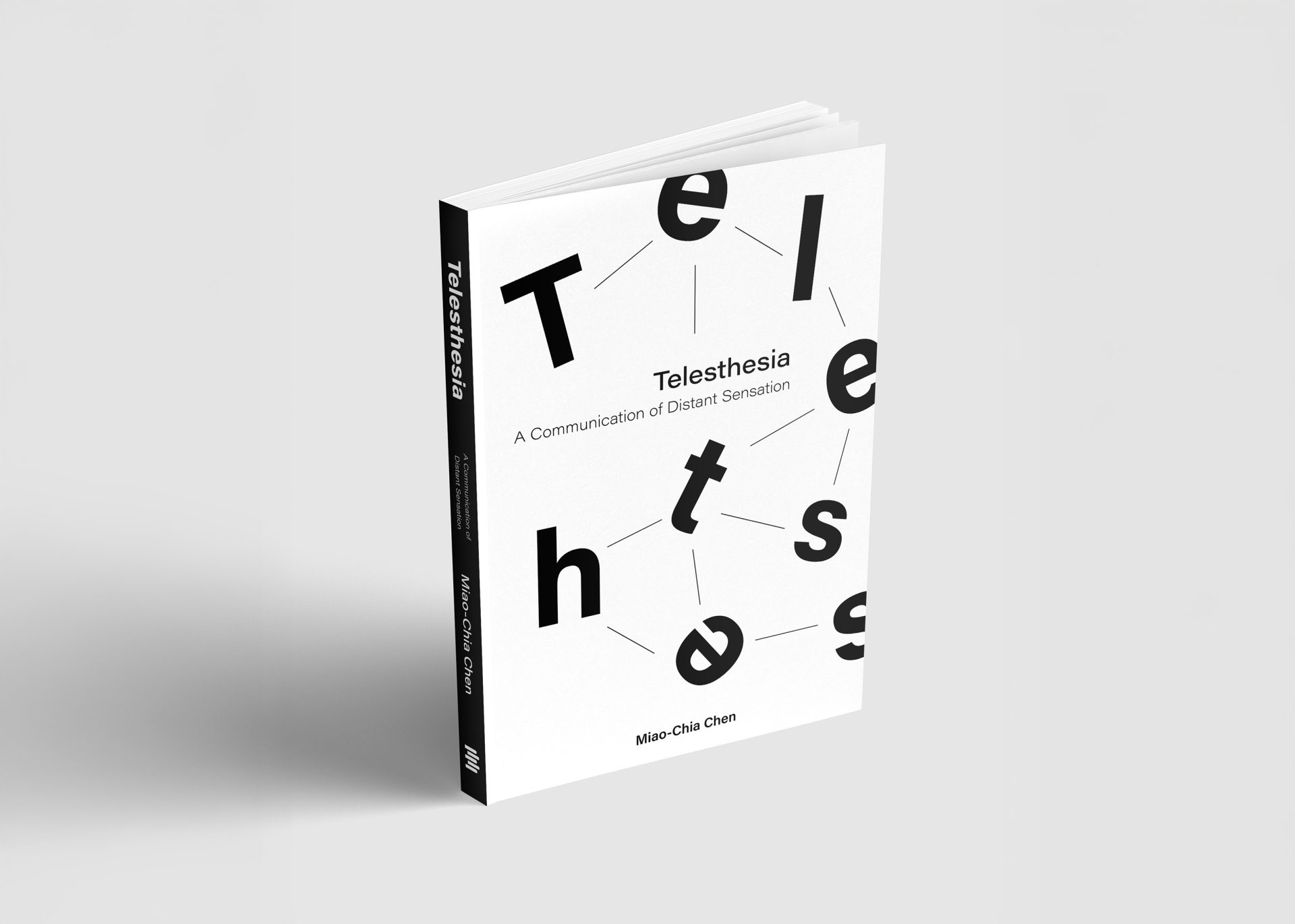
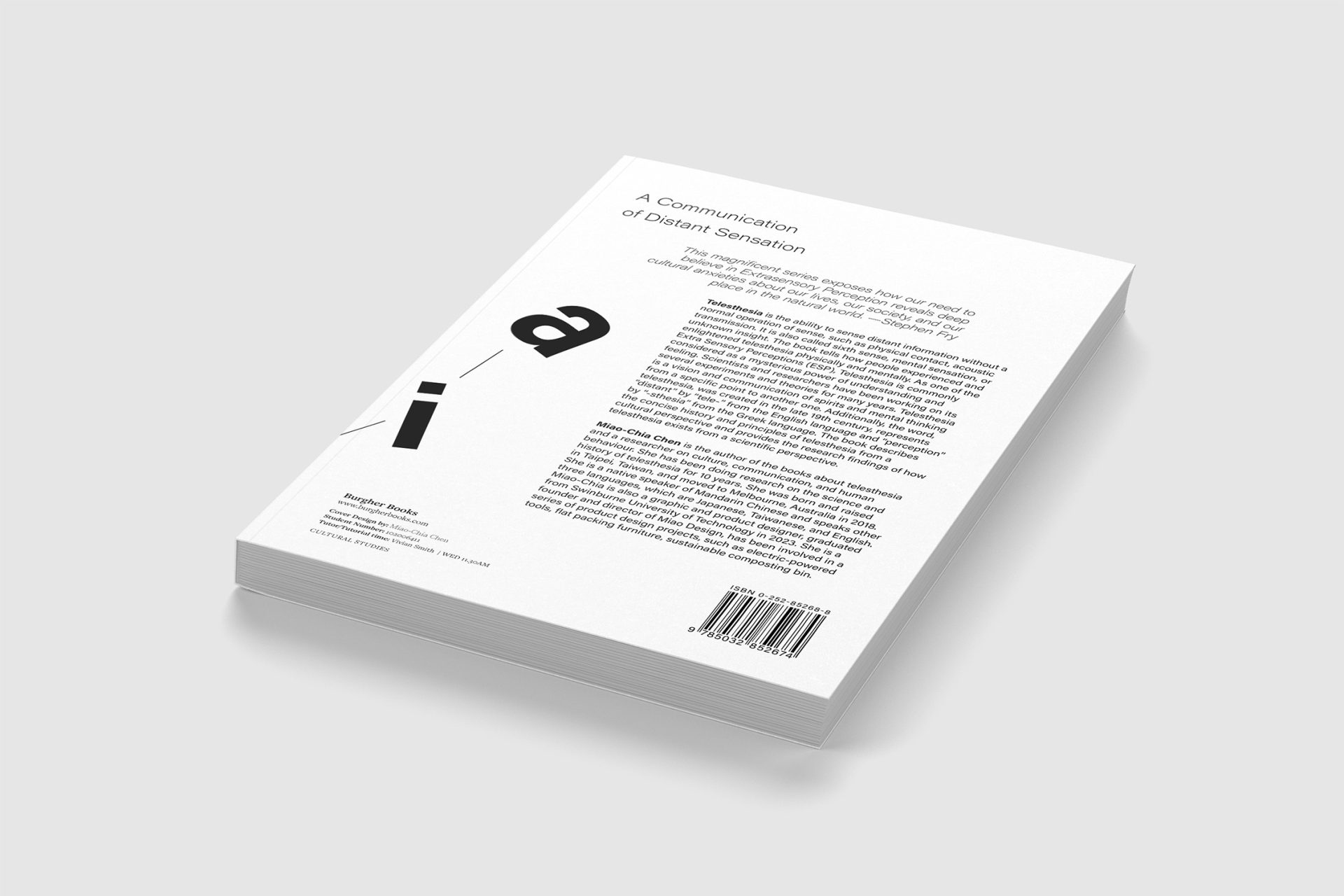
Each letter represents a piece of information released by different people and objects. On the cover, the letters are presented in larger scale than the book title, creating a visual tension. The missing “i” and “a” in “Telesthesia” become the main focus, highlighting both the title and the subtitle, A Communication of Distant Sensation.
On the spine, the words in white, grey, and black present the hierarchy. On the back cover, the missing “i” and “a” reappear, creating a sense of continuity between the front and back. The overall black-and-white color palette keeps the design minimal, avoiding unnecessary decoration while balancing clarity with a sense of mystery.
Design Specifications