
Background
SPIN+ Table Tennis Coaching Studio is a one-person coaching brand founded by professional table tennis coach Nick Cho. The studio offers adult table tennis training, private one-on-one coaching, and corporate group programs.
With over 8 years of experience teaching adult players, Nick specializes in ball placement and spin control. His expertise includes beginner instruction, technique correction, and match-based strategies, with a strong ability to tailor one-on-one training and corporate courses to different learning needs.
Guided by the core vision “From fundamentals to confident play,” the brand emphasizes understanding and accumulation in its teaching approach. Through patient, step-by-step instruction, students build a solid foundation and develop stable, confident playing skills.
Centered on systematic training and high-quality instruction, SPIN+ focuses on dedicated adult amateurs and corporate teams who are willing to invest time in learning, establishing a clear, credible, and professional brand image.
Business Card Design 名片設計 — 艾蘭小島設計
Project Brief
Without an existing logo, the business card incorporates table tennis–inspired elements such as paddles, balls, and table geometry. The design is adaptable to personal referrals, group classes, and corporate collaborations.
The design goal is to convey an energetic, clean, and confident visual language that highlights SPIN+’s focus on ball placement and spin, establishing its first brand impression.


Design Rationale
SPIN+ is a coach-centered personal brand built around Nick Cho, with SPIN+ as the core concept. The coaching strengths—ball placement and spin—are translated into visual form, where the white ball is intentionally rendered not as a perfect circle, capturing the dynamic state of high-speed rotation.
For typography, Neighbor Stencil is selected for its fine line details and circular forms, echoing the white lines of a table tennis table and the shape of the ball, creating a cohesive and concept-driven visual identity.

Concept 1: Arc & Spin
This concept is built around curvature, one of the most essential visual elements closely associated with spin in table tennis. From a side-view perspective, the ball’s trajectory is illustrated as a flowing arc that extends across both sides of the business card, creating a continuous and cohesive visual experience.
The color palette combines the iconic rubber red with table tennis ball white. Although racket rubber colors have become more diverse in recent years, red remains the most classic and instantly recognizable association with table tennis.
The card is printed on 300 gsm Light Ivory paper, which enhances tactile thickness while avoiding the dullness often found in standard ivory stock, resulting in a more refined and premium finish.


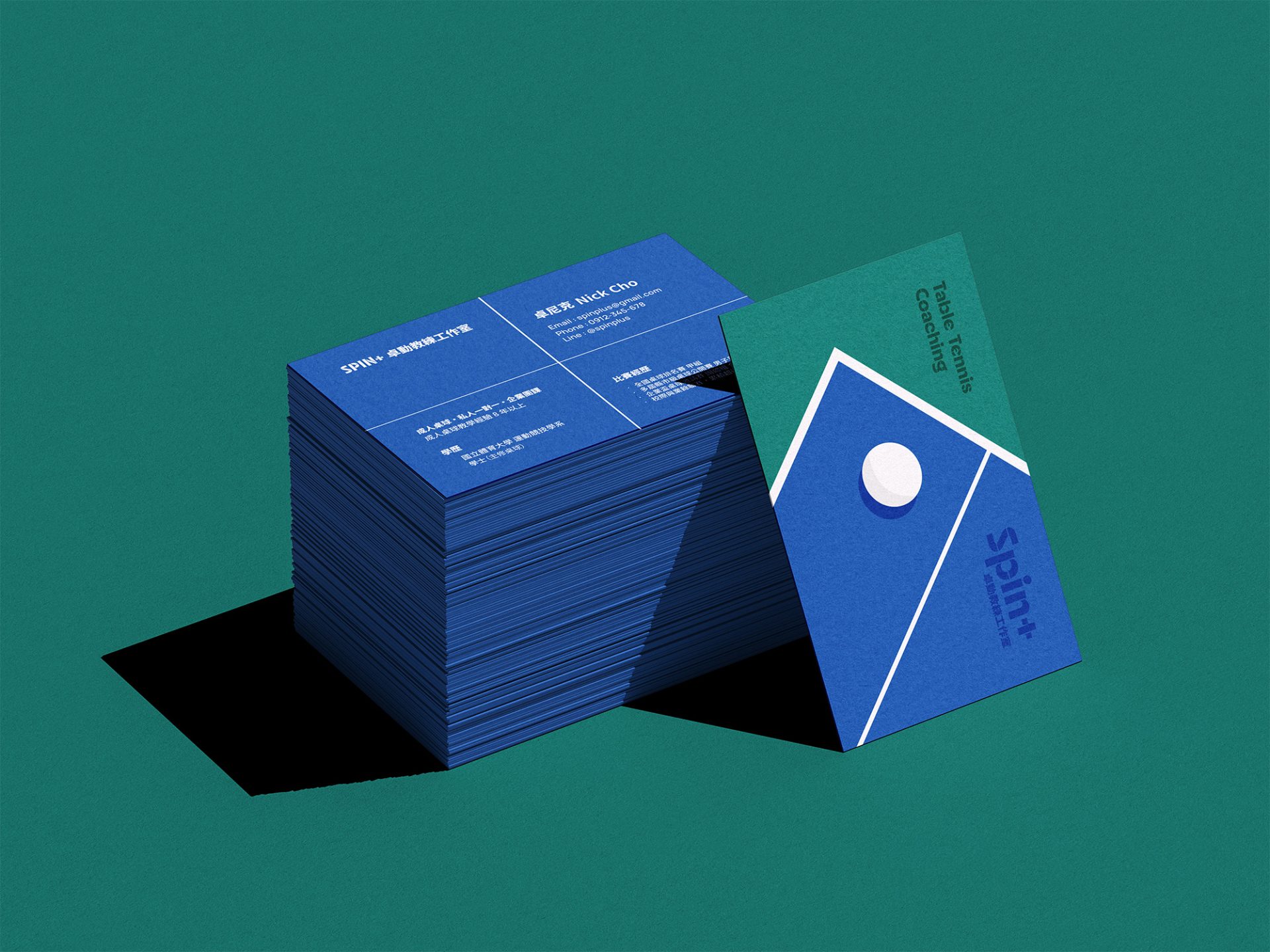
Concept 2: Placement & Spin
This concept centers on the table tennis table and ball, using the relationship between the ball and its shadow to express the idea of ball placement. The proportions of the ball and table are intentionally enlarged to place visual emphasis on the ball itself.
The ball shown represents a backspin serve, often the first technique most players learn. This choice not only reflects the teaching content but also symbolizes SPIN+’s brand vision: “From fundamentals to confident play.”
The reverse side presents a top-down view of a blue table tennis table, maintaining visual consistency with the front. Two white lines—one thick and one thin—represent the net and center line. For printing accuracy, the outer white border is intentionally omitted to avoid issues caused by trimming tolerances, while preserving clear recognition of the table layout.
The overall color palette is bright and energetic, reinforcing a brand image of confidence and dynamic play.
The card is printed on 350 gsm Premium Ivory paper. As the primary usage scenario is one-on-one conversations, the thicker stock helps establish an immediate sense of professionalism and trust, clearly distinguishing SPIN+ from standard group-based sports training brands.


