Background
LUNA SELECT is a lifestyle concept store founded by two women, with the intention of creating a space where people can slow down within the city.
Through gifts, everyday objects, and curated design pieces, the store invites people to reconnect with the details and textures of daily life, offering a moment of pause in an otherwise fast-paced urban routine.
Business Card Design 名片設計 — 艾蘭小島設計
Project Brief
As the brand is in its early stage, the business card serves as the first physical point of contact with the outside world, carrying both brand recognition and the role of establishing a visual language.
The core concept, “leaving a trace of light in everyday life,” is inspired by the name LUNA (moonlight), conveying a sense of calm, warmth, and airiness within urban living.


Design Rationale
A lifestyle concept store differs from a general household goods shop in that it does not simply sell products, but is guided by values, ways of living, and a curatorial logic.
LUNA SELECT uses moonlight as its core brand imagery, symbolizing the ability to preserve delicacy and calm within the busy rhythm of the city, and to bring a quiet sense of ease into everyday life.
As the store operates from 11:00 to 20:00, extending from day into evening, a dark color palette was not chosen as the primary tone.
Instead, an airy sky blue serves as the base color, paired with a warm moon yellow, expressing the transition between daytime and night and reinforcing the brand’s positioning around everyday living rather than a purely nocturnal atmosphere.

Concept 1: A Trace of Moonlight
This proposal adopts a rule-breaking approach by presenting only a partial view of the moon, yet keeping it clearly recognizable. Through this sense of incompleteness, viewers are invited to mentally complete the image, echoing the brand’s core idea—leaving a trace of light in everyday life.
The business card uses 250gsm ivory cardstock, chosen for its smooth, sturdy feel and restrained color rendering. With no strong surface texture to distract the eye, the visual focus remains entirely on the image itself, allowing the moonlight to become the sole protagonist of the composition.


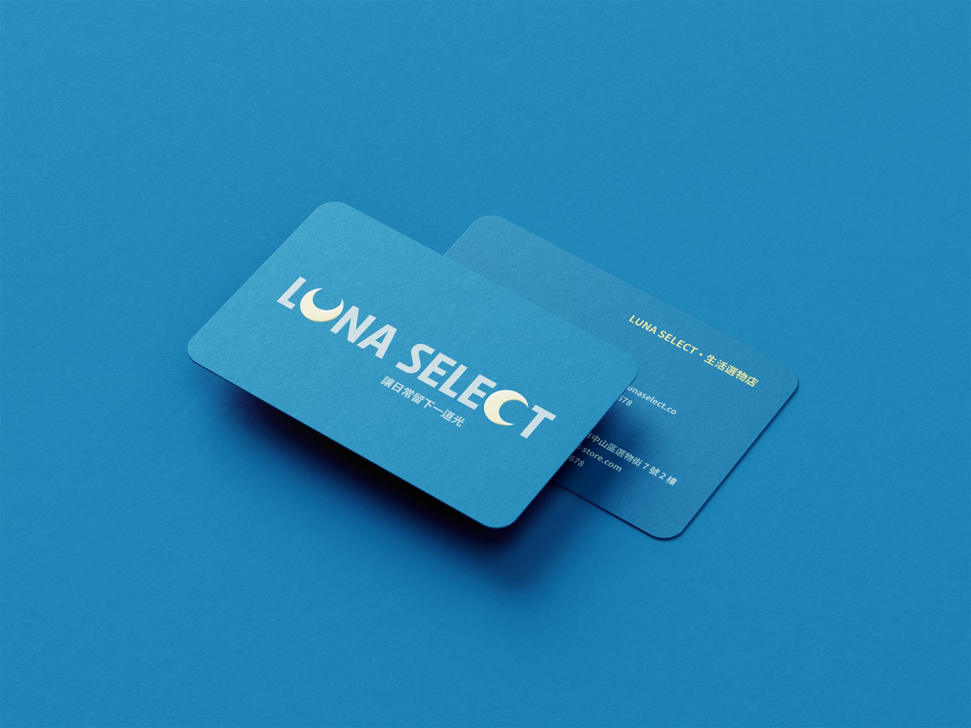
Concept 2: Two Moons
Inspired by the two founders, this proposal integrates the idea of two moons into the brand name, symbolizing a shared and co-created brand.
The business card specification uses premium cardstock with double-sided matte lamination and front-side spot UV, paired with 5R rounded corners.
The two moons on the front are finished with spot UV, allowing light to reflect subtly against the matte surface. This quiet reflection conveys a sense of deep urban calm and echoes the soft, elusive quality of moonlight.
The matte finish provides a refined tactile quality while offering water and dust resistance, enhancing durability. Rounded corners further reinforce the brand’s gentle and warm character, inspired by moonlight.