Background
Atlas Strategy is a management consulting firm founded by a former multinational consultant, focusing on supporting small and medium-sized enterprises and startups in business decision-making, organizational operations, and strategic planning.
Starting from people and organizational behavior, the firm applies a psychological perspective to identify recurring root-level issues, simplifying complex situations and helping organizations see what truly affects how they operate.
Its core goal is to help businesses build management systems that are human-centered and capable of long-term, sustainable operation.
Business Card Design 名片設計 — 艾蘭小島設計
Project Brief
The business card design communicates three core values: human-centered thinking, rational analysis, and sustainable management. It is primarily used in initial meetings, before and after strategy discussions, as well as in business introductions and referrals.
The design strengthens Atlas Strategy’s professional image as a management consulting firm that values depth of thinking and rational analysis.


Design Rationale
Atlas Strategy approaches complex, root-level challenges through the lens of human-centered thinking and rational analysis, with the goal of simplifying complexity into clarity.
The visual direction is grounded in minimalism, creating a calm and composed atmosphere that supports clear, rational thinking. Generous use of white space establishes a sense of balance, restraint, and professional confidence.
Green is selected as the primary color, reflecting a commitment to human-centered values and sustainable management systems designed for long-term operation.
Concept 1: Strategic Management
Based on the idea of breaking down problems and building rational strategies, this proposal translates Atlas Strategy’s step-by-step analytical approach into a visual language.
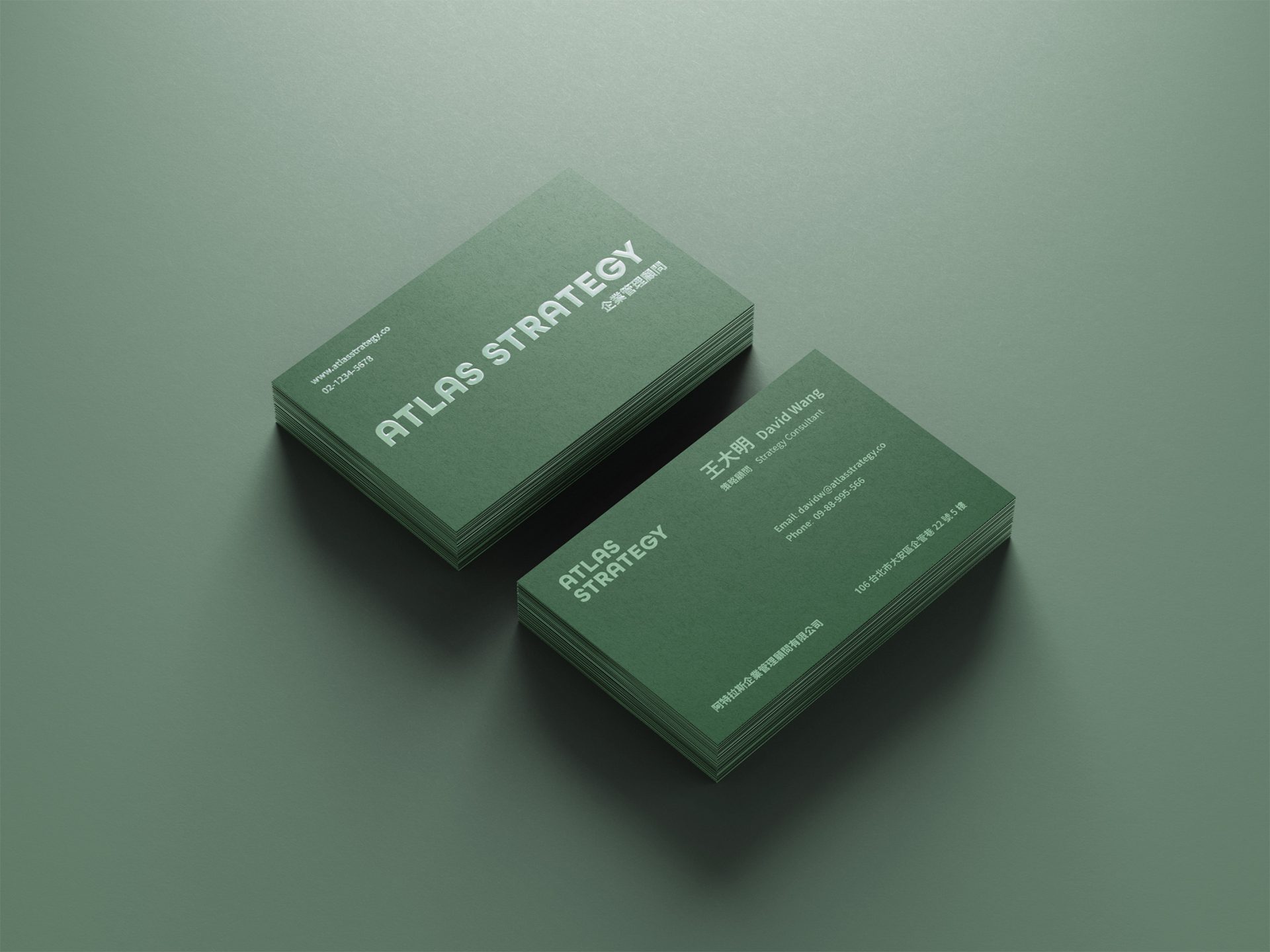
The Utopian typeface is used to represent rational analysis and structured thinking, while a dark blue-green palette conveys focus and restraint in problem-solving.
The business card uses 220gsm fine-textured paper with silver foil stamping. The irregular, sand-like surface texture creates a subtle, composed professional quality, with silver foil typography reinforcing trust in a human-centered, sustainable approach.


Concept 2: Simplifying Complexity
Text is centered with more extreme use of white space, further reinforcing the concept of simplification while emphasizing visual breathing room and a rational rhythm.
A softer, calming mugwort green is used to deepen the sense of rational communication built on human-centered understanding.
The business card uses premium cardstock with double-sided matte lamination and front-side spot UV. The spot UV reflects subtly against the matte surface, allowing the Atlas Strategy logotype to catch light through layered contrast.
The double-sided matte finish also provides water and dust resistance, enhancing overall durability.